How to edit the registration form
The registration form is where the participant leaves their details and picks how they will take part. In the SF-CONFERENCE system you build it yourself: you add fields, set their order, describe them in your own words, attach prices and decide who sees what, and when. There is no rigid template the event has to be squeezed into. Below we go through every setting in turn: from opening and closing registration, through the text above the form and below it, all the way to text fields, select fields, prices and the dates on which they apply.
Where to find the forms
Everything happens in the Forms entry in the side menu of the panel. The view splits them into three tabs. Standard forms are created by the system and that is where you will find the Registration form, the one filled in when signing up for the event. Custom forms are made available to participants only after registration, on their participation summary page. They work well as surveys or sign-ups for extra activities. External forms work independently of registration and have an address of their own, which you can send to people outside the attendee list.
When registration is open
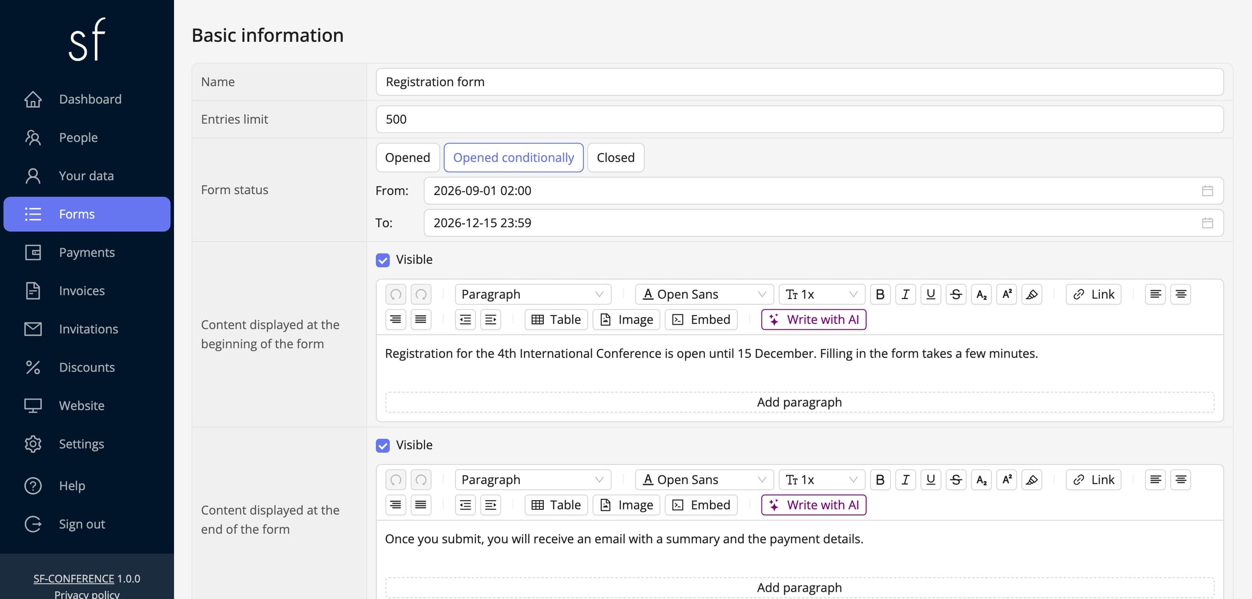
Click Registration form and its page opens. It starts with the Basic information section, in which the Form status field decides whether the form takes entries at all. There are three states. Opened means the form works with no time limits. Closed stops registration at once. Between them sits Opened conditionally: picking it reveals two fields with a date and time, From and To. The form opens and closes on its own at the times you set, so you do not have to remember to log into the panel at midnight.
The two dates are independent. A From date on its own opens registration at the appointed moment and leaves it open, a To date on its own closes it at the given time without setting a start. Whatever the status, administrators with the right permission can add entries even when the form is closed to participants, so closing registration never cuts you off from adding someone by hand.
Just above the status there is the Entries limit. Once the entered number is reached, the form stops taking further entries even though it stays open. An empty value means no limit.
The text above and below the form
In the same section you will find three text editors. Content displayed at the beginning of the form appears above the first field. It is a good place for a welcome, the date and venue of the event or a note about what needs to be prepared before filling it in. Content displayed at the end of the form lands under the last field, right above the submit button, so information about the next steps, the payment deadline or the terms naturally fits there.
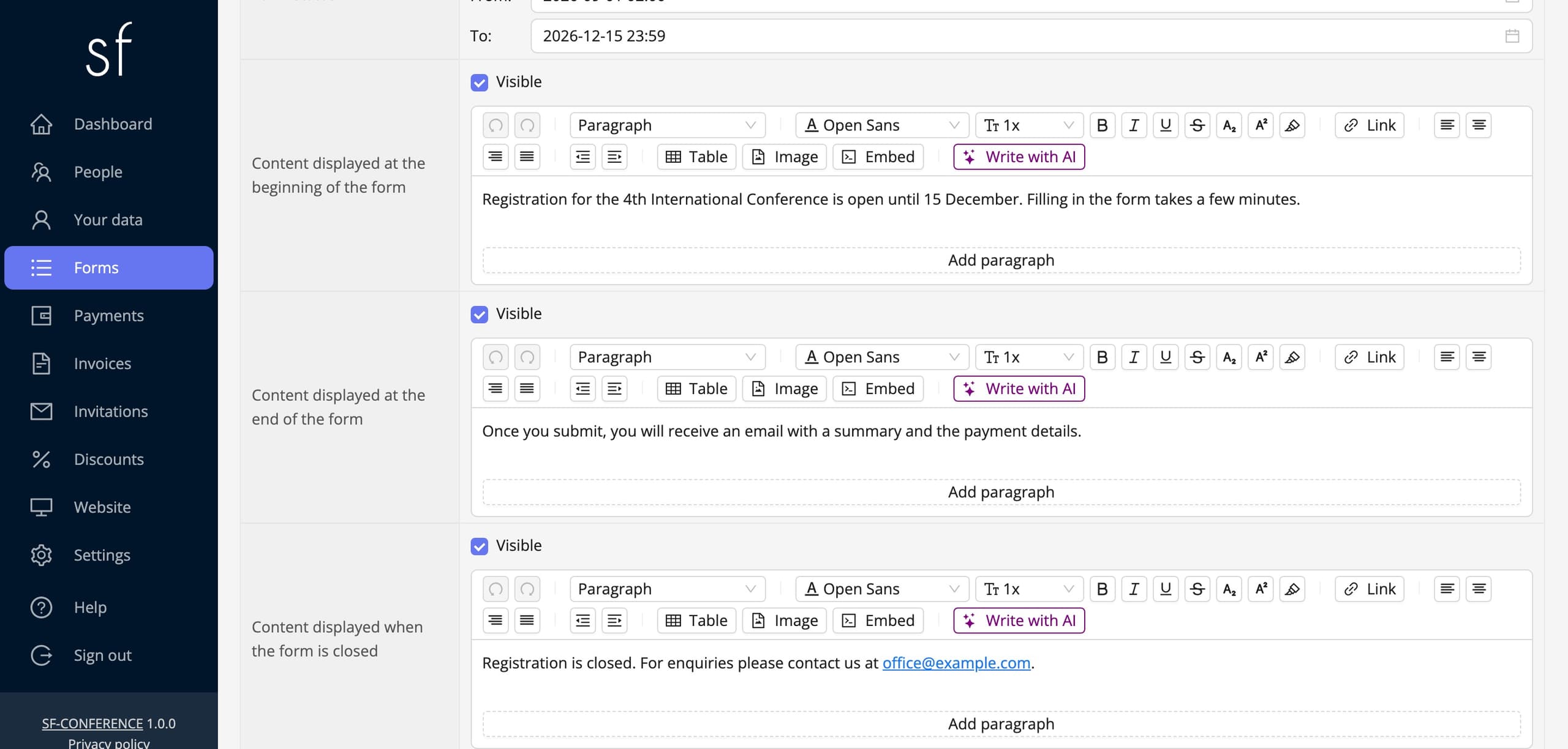
The third editor, Content displayed when the form is closed, replaces the whole form in the moment registration is closed, manually, by a passed deadline or by an exhausted limit. It is worth filling in advance, because without it someone who reaches the form after the deadline sees a system message instead of your explanation and the address they can write to.
Each of these texts is entered separately in every language of the event. Above the form there is a language switch that changes which version you are filling in at the moment. The editor lets you bold a fragment, add a list or a link, so you are not limited to a plain paragraph.
Sections and fields: how the form is built
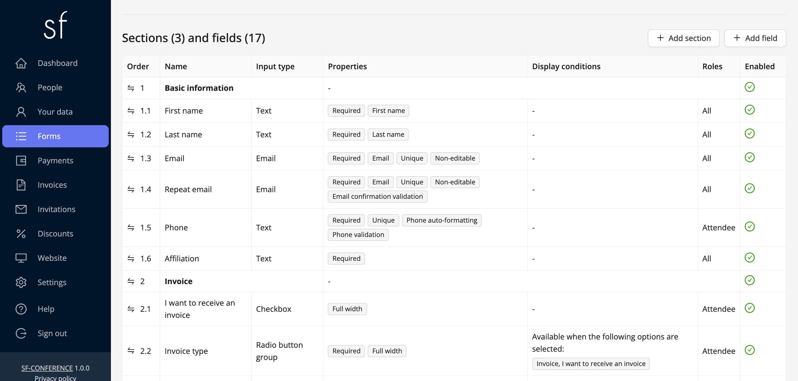
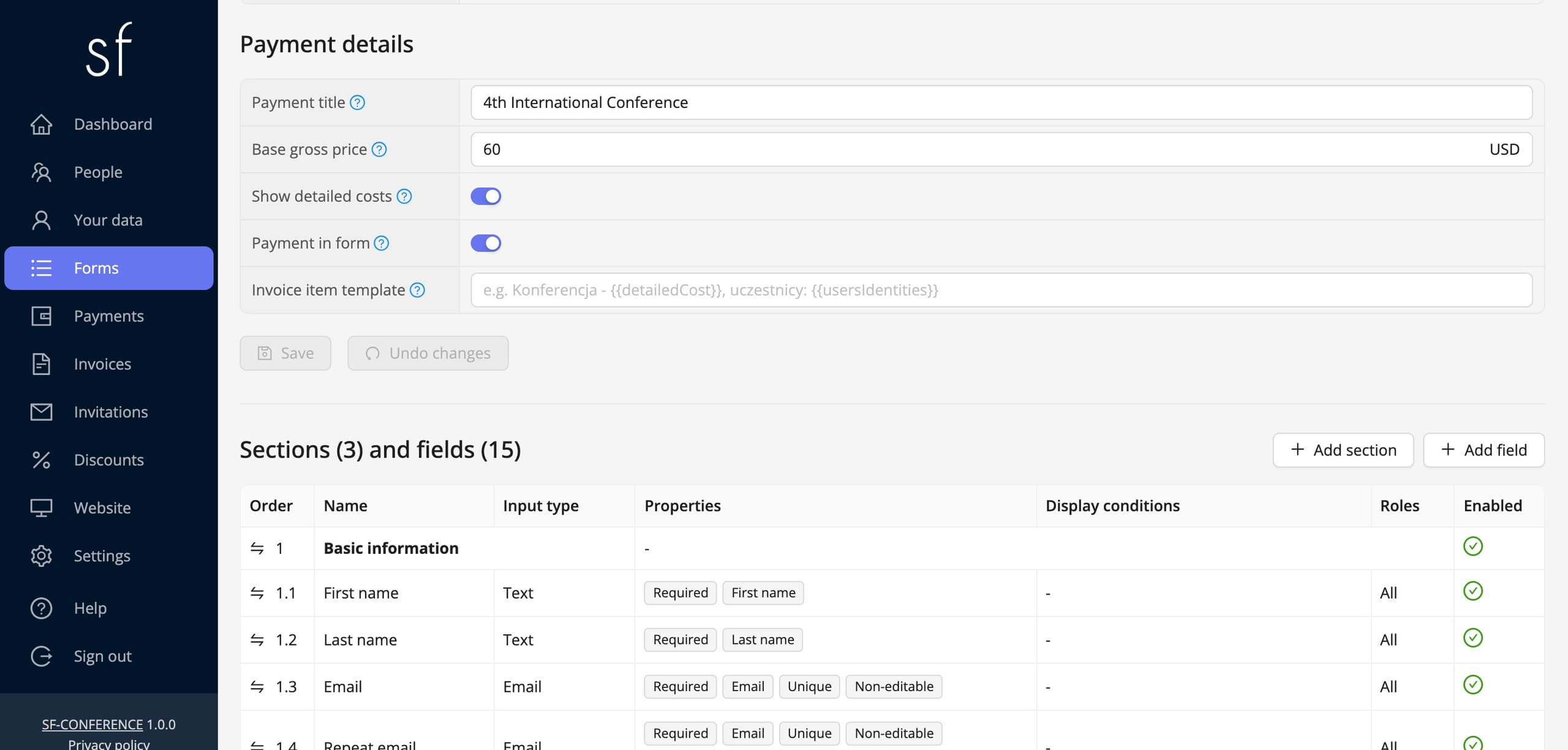
Below the settings of the form sits the Sections and fields table. It is the full map of the form. A section is a group of fields with a heading of its own, and a field is a single question. Every field belongs to exactly one section. Section rows are printed in bold, and the fields belonging to them follow underneath with numbering like 2.3, meaning the third field of the second section.
The columns of the table show the most important settings straight away: Input type, Properties, Display conditions, Roles and Enabled. Thanks to that you see in one place which fields are required, which depend on something and which have been switched off for now. Clicking any row opens the page of that section or that field.
Adding a new field
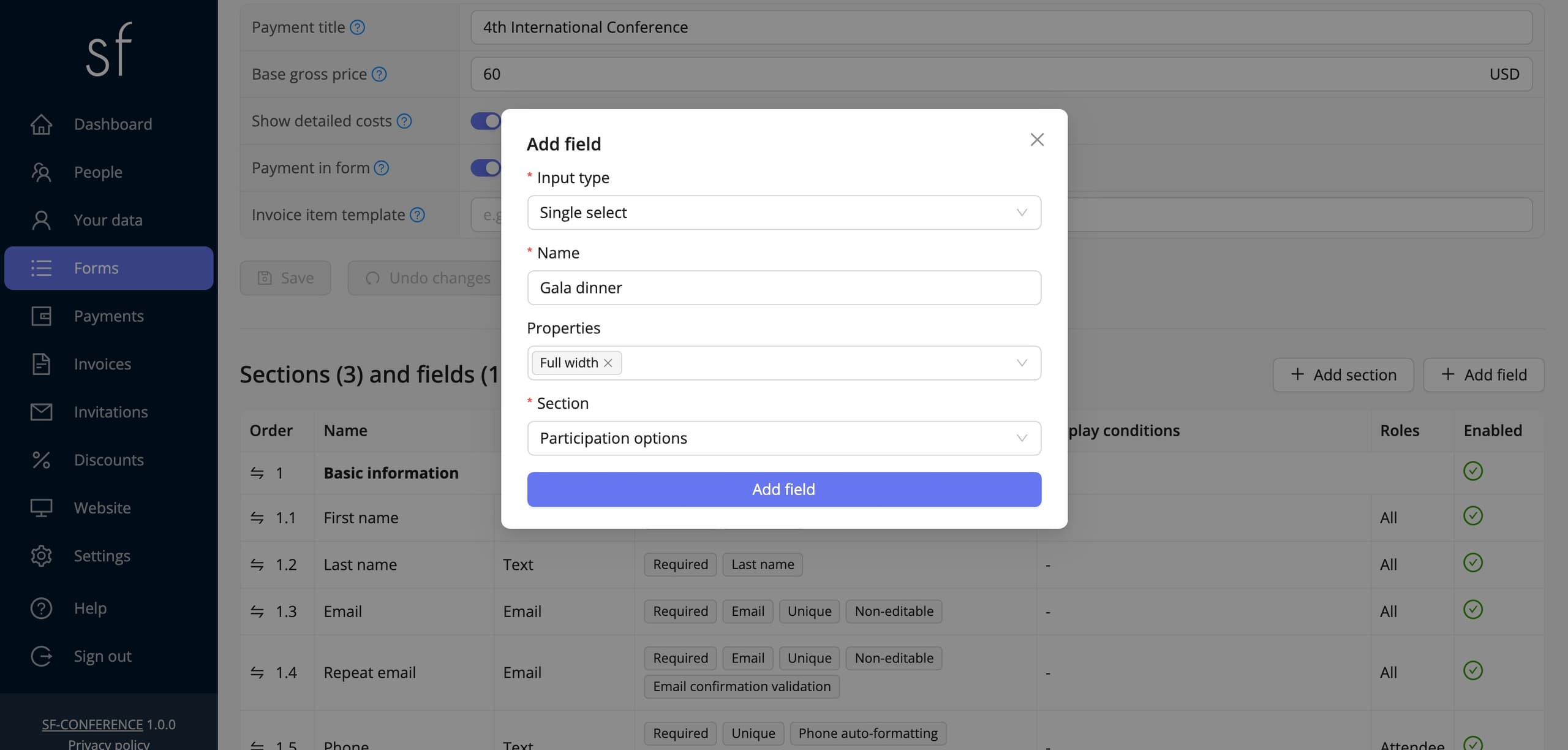
Above the table there are two buttons: Add section and Add field. The field dialog asks for four things only. Input type determines the kind of question and is the one setting worth thinking through in advance, because the rest of the options depend on it. The list of types carries a short description next to every entry, so there is no guessing. Name is the label shown above the field in the form, entered in every language of the event. Properties is the set of switches described below, and Section points at the group the field should land in.
Once saved, the field appears at the end of the chosen section, and the system opens its page, where all the remaining settings are already available. The input type can be changed later too, although when switching from a select field to a text one the defined options stop applying, so it is safer to change the type before the first entries arrive.
Text fields
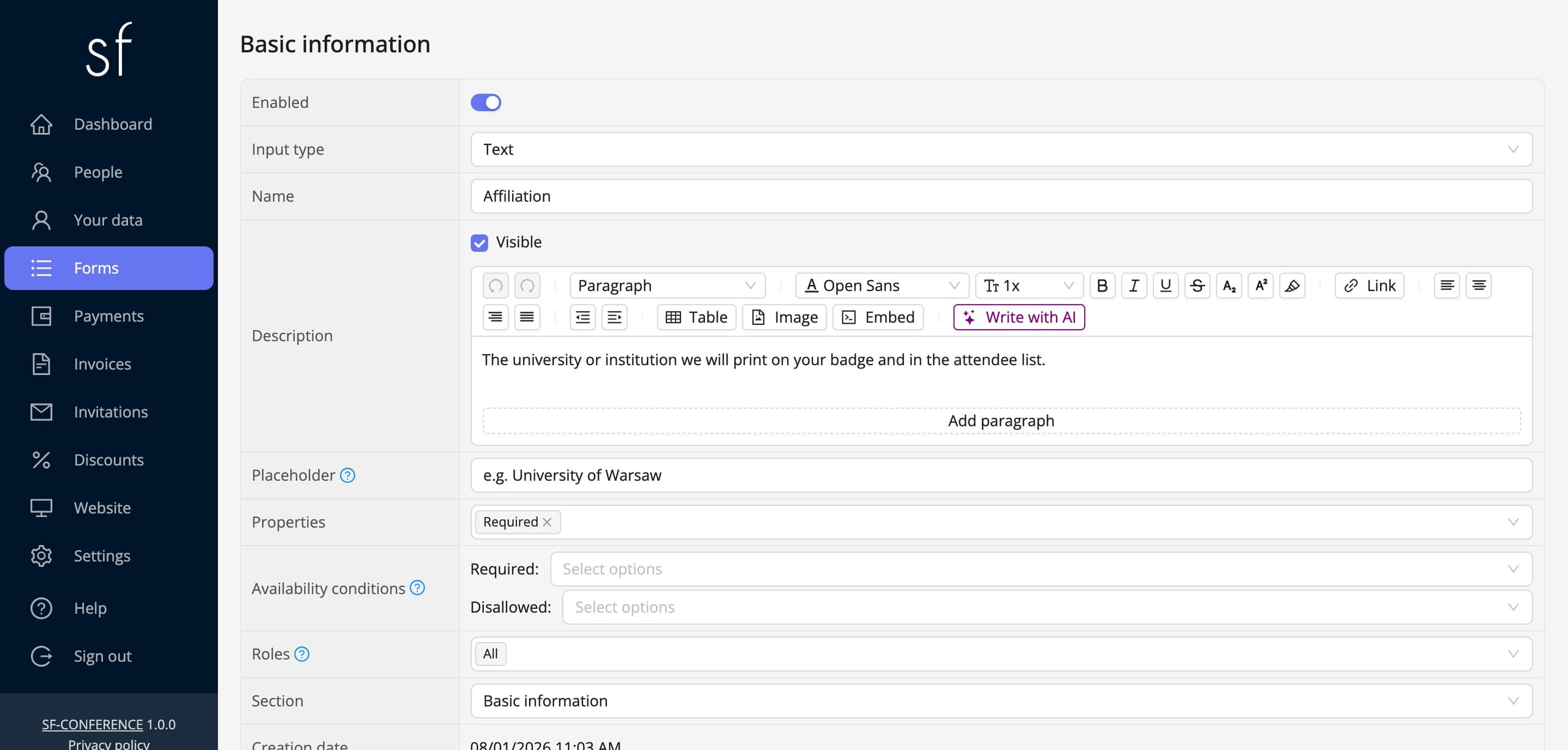
Several types collect data typed in by hand. Text holds a short string, a first name or an affiliation for example. Text box is larger and suits notes or a short description. Editor gives the participant text formatting, useful for longer content. Email additionally checks that the address is valid, and Numeric field accepts numbers only. Multiple texts lets people add entries one under another, a list of co-authors for example. File fields are a group of their own - PDF file, ZIP file, Image file and Document file - in which the participant uploads an attachment instead of text.
On the page of a field, besides the Name, you fill in the Description, the smaller text under the label in which you explain what exactly you are asking about. There is also the Placeholder, the grey hint shown in an empty field until the participant types anything. In the Advanced settings section you will additionally find Character limit for text fields and Item limit for the field that lets people add many values. An empty value means no limit in both cases.
Select fields and their options
The second family is made up of fields where the participant picks from a list you prepared. Single select is a dropdown with one answer, and Multiple select lets several be ticked at once. Radio group shows the same answers as an always-visible list, without unfolding, and Radio button group does the same in a more prominent, button-like form. On top of that there is Checkbox for a single consent and two lists built by the system: Country select and Category select.
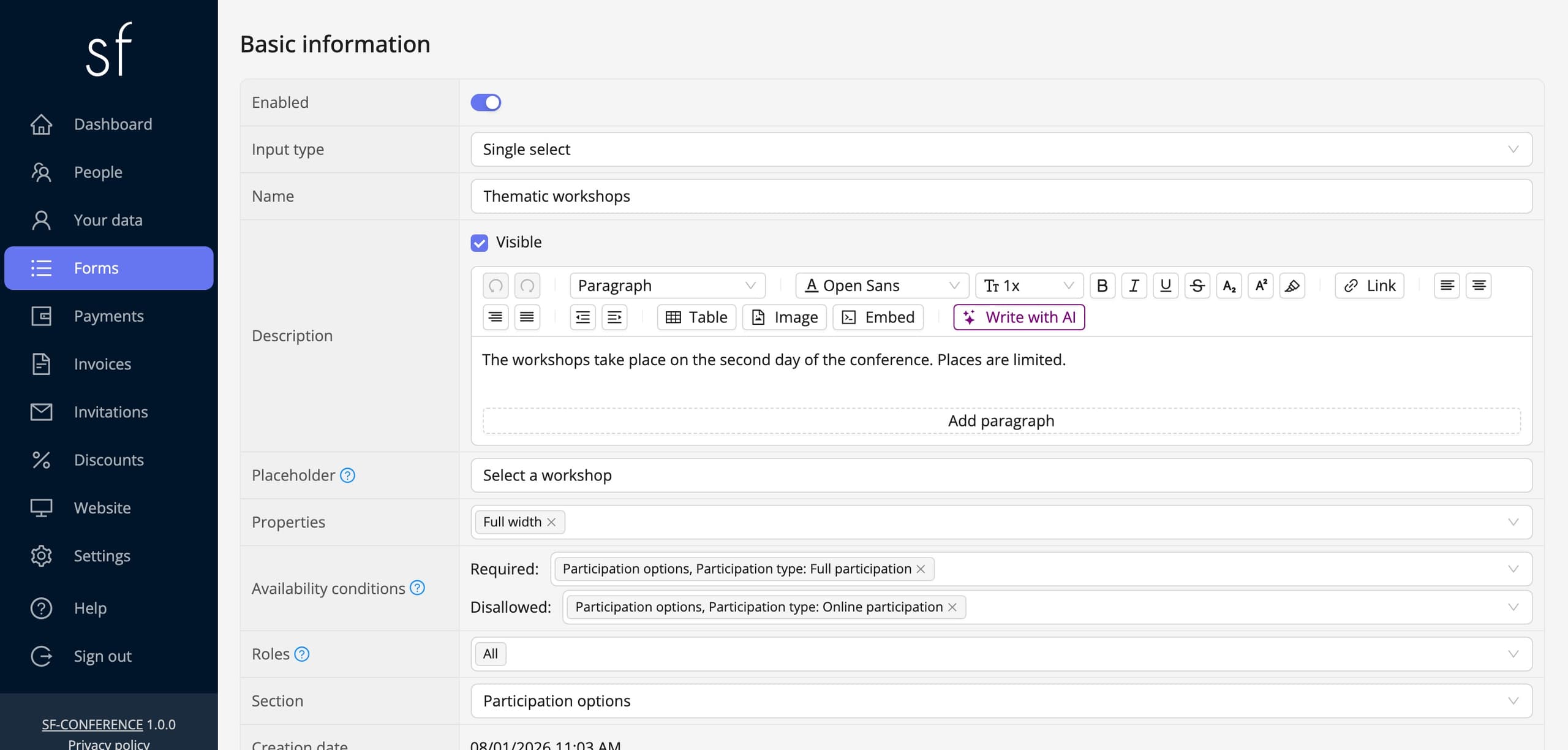
For these types an Options section appears on the page of the field, with an Add option button. Every option is a card of its own, in which you give the Name the participant will see. For the country and category selects there is one more field, Type: Single option is an entry you create yourself, and Predefined list puts a ready-made set prepared by the system in that place, so you never have to retype every country by hand.
The order of the options is set in the header of each card, and the red button on the right removes an option. The rest of the settings hide under the collapsible Advanced settings section, described in the following parts of this guide.
Field properties
Properties is a set of switches that change how a field behaves. The most used one is Required: a form cannot be submitted until such a field is filled in. Full width stretches the field across the whole width of the form instead of laying it out in two columns. Unique makes sure that no two people enter the same value, which helps with numbers and identifiers; once it is on, an extra field for your own error message appears. Non-editable blocks changing the answer after the registration has been sent.
The second group of properties decides where the value of a field shows up outside the form itself: Visible in people table adds a column to the attendee list, Visible in XLS includes the field in the export, Visible in statistics counts it in the summaries, and Visible on summary page shows the answer back to the participant after registration. Visible only to administrators works the other way round: the field stays in the panel, but the participant never sees it, so it suits internal notes.
The third group gives a field a concrete meaning. First name, Last name, Title and Email tell the system which field holds the details identifying a person, so that it can use them in messages, on the attendee list and on badges. The properties prefixed with Invoice mark the fields with the company name, tax number and address that go onto the sales document. Properties checking that the entered value is correct work separately - phone number validation, email confirmation or fetching company data by tax number. The list of properties depends on the input type and on the enabled modules, so at every field you only see the ones that make sense.
Prices
A price is an ordinary field setting, not a separate price list. For select fields you will find it in the Advanced settings of every option, so full participation can cost a different amount than the student one, and the gala dinner adds its own amount on top of both. For fields without options, a checkbox for example, the price belongs to the field itself and is added once the participant ticks it. An empty value is treated as zero and no amount is then shown next to the option.
You enter the amounts in every currency supported by the event. The currency switch sits at the top of the page of a field, next to the language switch. Whether you type a net or a gross price depends on the payment settings of the event and you can see it straight in the label of the field, which reads Net price or Gross price.
Some pricing settings apply to the whole form and live on its own page, in the Payment details section. Base price is added to every participant regardless of what they pick, so it suits a fixed entry fee. Payment title is the description the participant sees on the transfer and on the invoice. Show detailed costs breaks the summary down into individual items instead of showing the total alone, and Payment in form moves the choice of payment method into the registration itself, so the participant goes straight to the payment page after submitting.
Early-bird and regular price
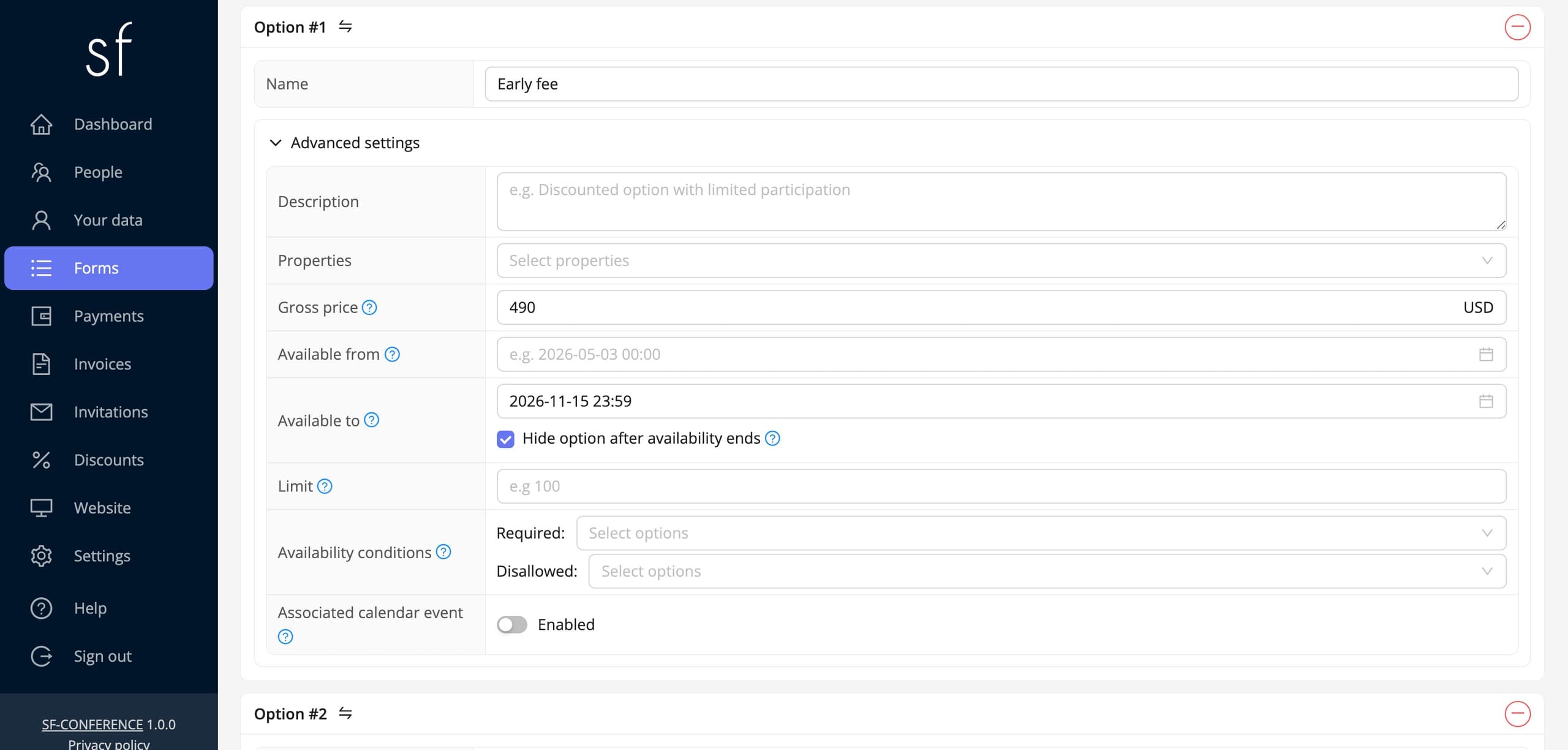
There is no separate "early bird" switch in the system, because none is needed. You assemble an early price out of two options of the same field: a cheaper one, available only until a set day, and a second at the regular price that takes over the day after. Both describe the same participation; they differ in amount and in date.
In practice it goes like this. Add a select field, Conference fee for example, and create two options in it. Give the first, Early fee, the lower amount and set Available to to the last day of the promotion. Give the second, Regular fee, the full amount and set Available from to the day after. The two windows must not overlap, or for a moment both prices would be on screen at once and the participant would pick the cheaper one.
Two switches remain, and without them the effect is only half there. On the early option tick Hide option after availability ends, and on the regular one Hide option until availability. Without them both entries stay in the form the whole time, with one of them merely marked as unavailable. With them the participant always sees exactly one price, and the switch from one to the other happens on its own, at midnight on the day you set.
Instead of a date you can base the promotion on a number of places. Give the early option a Limit - fifty, say - and tick Hide option when the limit is exhausted. The cheaper entry then disappears after the fiftieth registration, whatever the date. The two methods also work together, when the promotion should end once the pool runs out or once the deadline passes, whichever comes first.
The same method builds any number of price steps, not just two: three options with three non-overlapping windows give an early, a standard and a late price. You enter the amounts in every currency of the event, and what reaches the participant's payment is the option they actually picked, plus the form's Base price if you set one.
Limits and dates of individual options
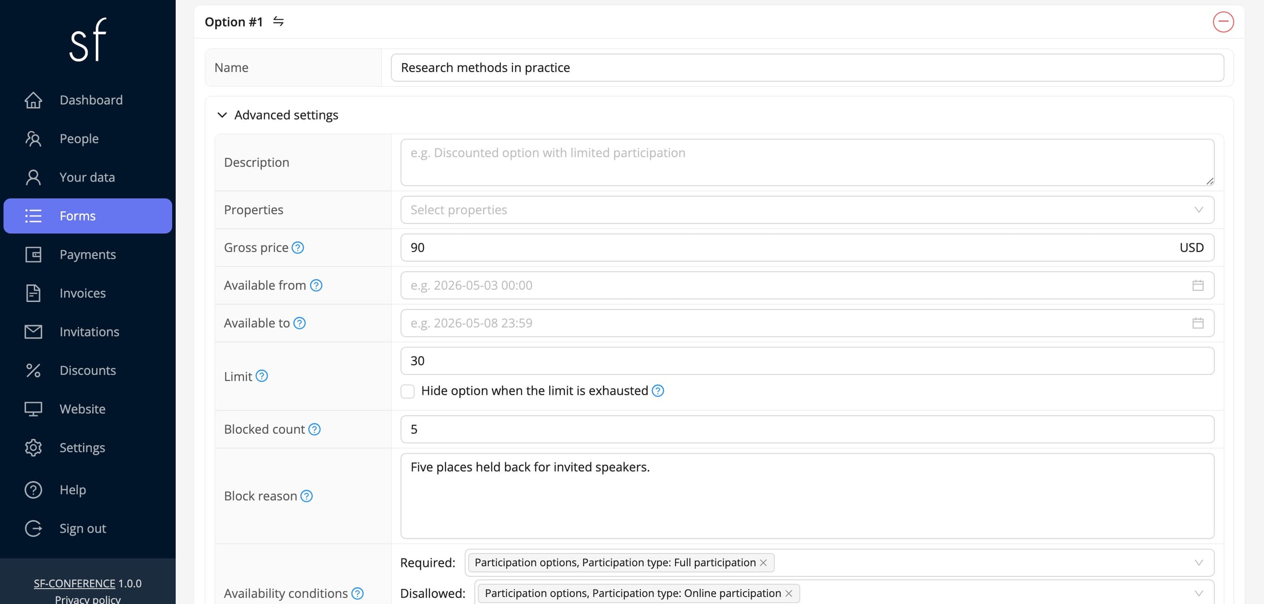
Every option has its own Limit, the number of people who can pick it. An empty value means no limit, and a zero means the option is unavailable. Once a limit is set, two more fields appear: Blocked count lets you put part of the pool aside outside the system, for invited guests for example, and Block reason leaves a short note, so that months later you are not guessing where the difference came from.
The Available from and Available to fields limit an option in time. The option appears and disappears on its own at the hour you set, so there is no calendar to watch. They are what the early-bird price above is built on, but they help anywhere something is available for only part of the registration. The same fields are available for the whole field as well, when it has no options.
Each of these limits comes with a checkbox of its own, starting with the word Hide. By default an unavailable option stays visible in the form, only marked as unavailable. The participant knows such a thing existed and does not write with a question. Ticking the checkbox removes it from the view entirely. The choice is yours and can be different for an exhausted limit, a passed date and unmet conditions.
Fields for selected roles
Every field of the registration form has a Roles list. You point in it at who the field applies to at all: attendees, reviewers, administrators or entry staff. Leaving the list empty means everyone. A role does not depend on anything the participant types in the form, it follows from who a given person is in the system, which makes it the simplest way to ask something only one group should ever see.
Sections and order
Sections organise the form and it is worth creating them before the fields, because adding a field requires pointing at where it should land. The Add section button asks for a name only, and on its page you fill in the Description shown under the heading as well as the Properties: Hidden name hides the heading when a grouping is convenient for you but unnecessary for the participant, and Divider above draws a line separating the section from the previous one.
The order is changed in the first column of the table, marked with the arrows icon. It unfolds the Move field before and Move field after menu, in which you point at the neighbour the field should stand next to. A field moves within its own section, and to shift it elsewhere, change its Section on the page of the field. Sections are rearranged the same way, with Move section before and Move section after.
Sections and fields also have an Enabled switch. A disabled field disappears from the form but keeps every answer collected so far, which makes it a safer way to withdraw a question than deleting it together with its history.
Saving changes
Changes on the pages of a form, a section and a field are confirmed with the Save button at the bottom. The order in the table saves immediately, without confirming. After saving, the form works in its new shape straight away, so if registration is already running it is worth doing bigger rebuilds with the form temporarily closed, or before opening it. Remember too that text fields are filled in separately in every language of the event. The switch at the top of the page shows which version you are editing, and a missing translation will stop the save.
Building the form in short
Building the form comes down to a few decisions repeated for every question: which input type, in which section, with which properties and at what price. The form status and the three text editors decide what the participant sees before registration, during it and after it closes. Everything you collect lands in the same database as payments, invoices and mailings, so you never have to reconcile separate lists. More about what the form itself can do is in the description of the registration form.
See all instructions 2026 © SF-LABS sp. z o.o.ul. Józefa Marcika 6, 30-443 KrakówAll rights reserved+48 512 988 220office@sf-labs.comwww.sf-labs.comEntered into the register of entrepreneurs of the National Court Register kept by the District Court for Kraków-Śródmieście in Kraków, 11th Commercial Division of the National Court Register, under KRS number 0000886671. Share capital amount: PLN 5,000.